OVERVIEW

UI Design & Prototyping Exercise

      INTRODUCTION

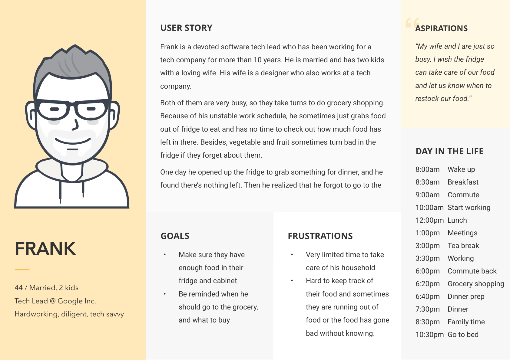
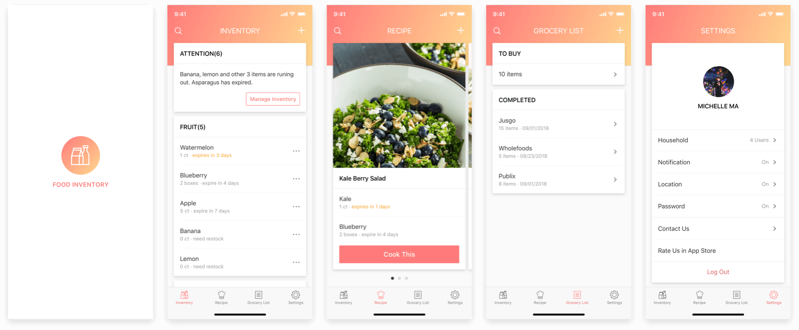
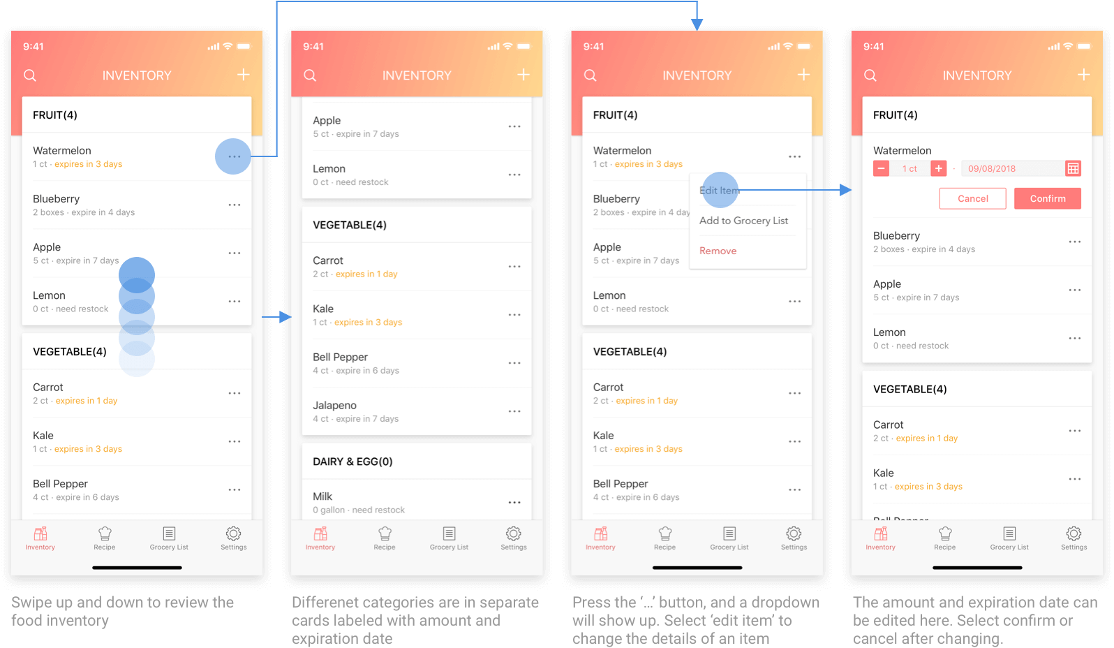
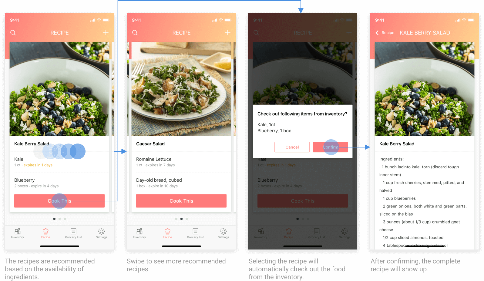
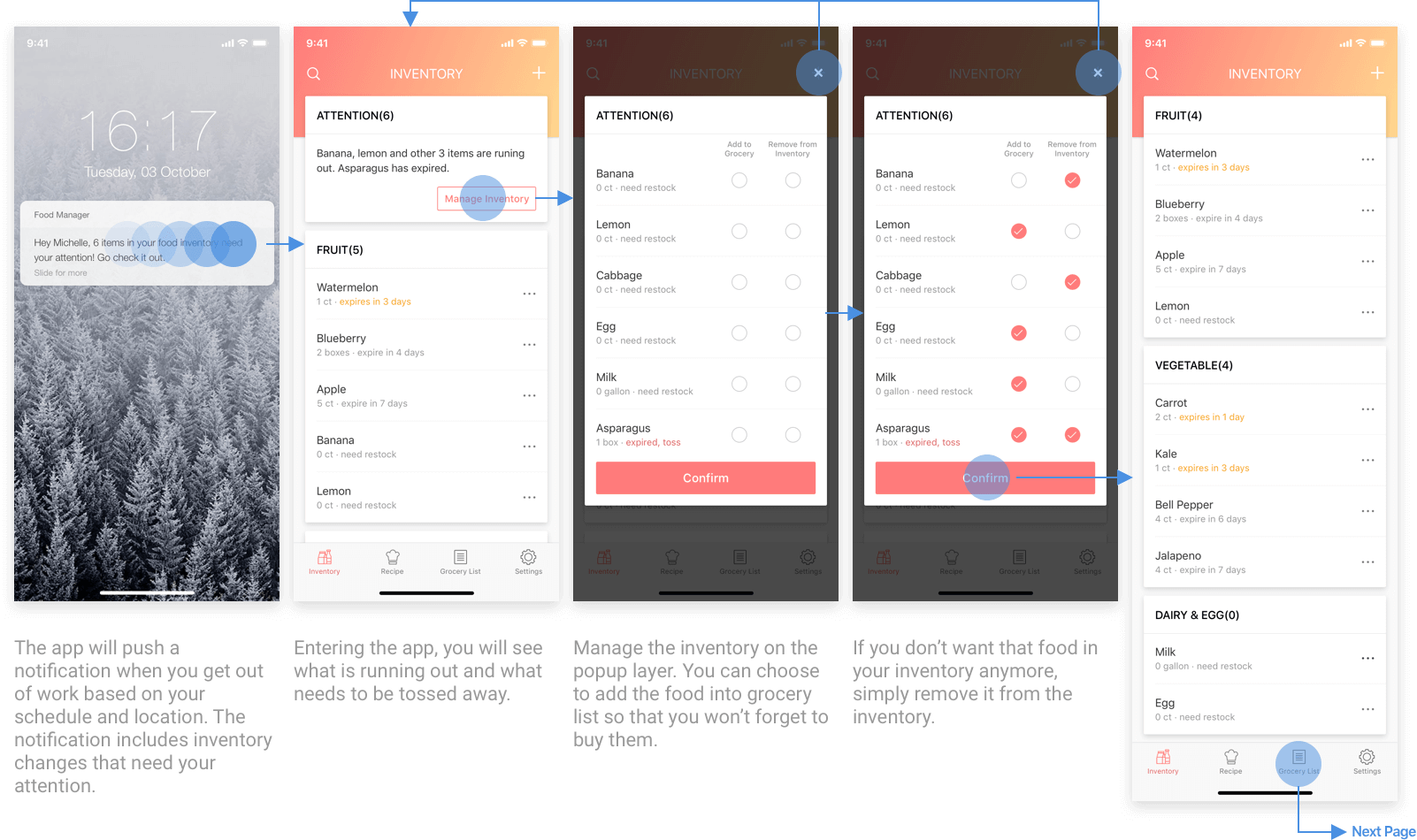
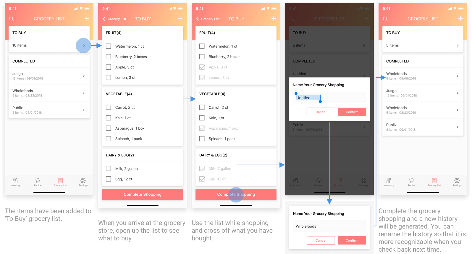
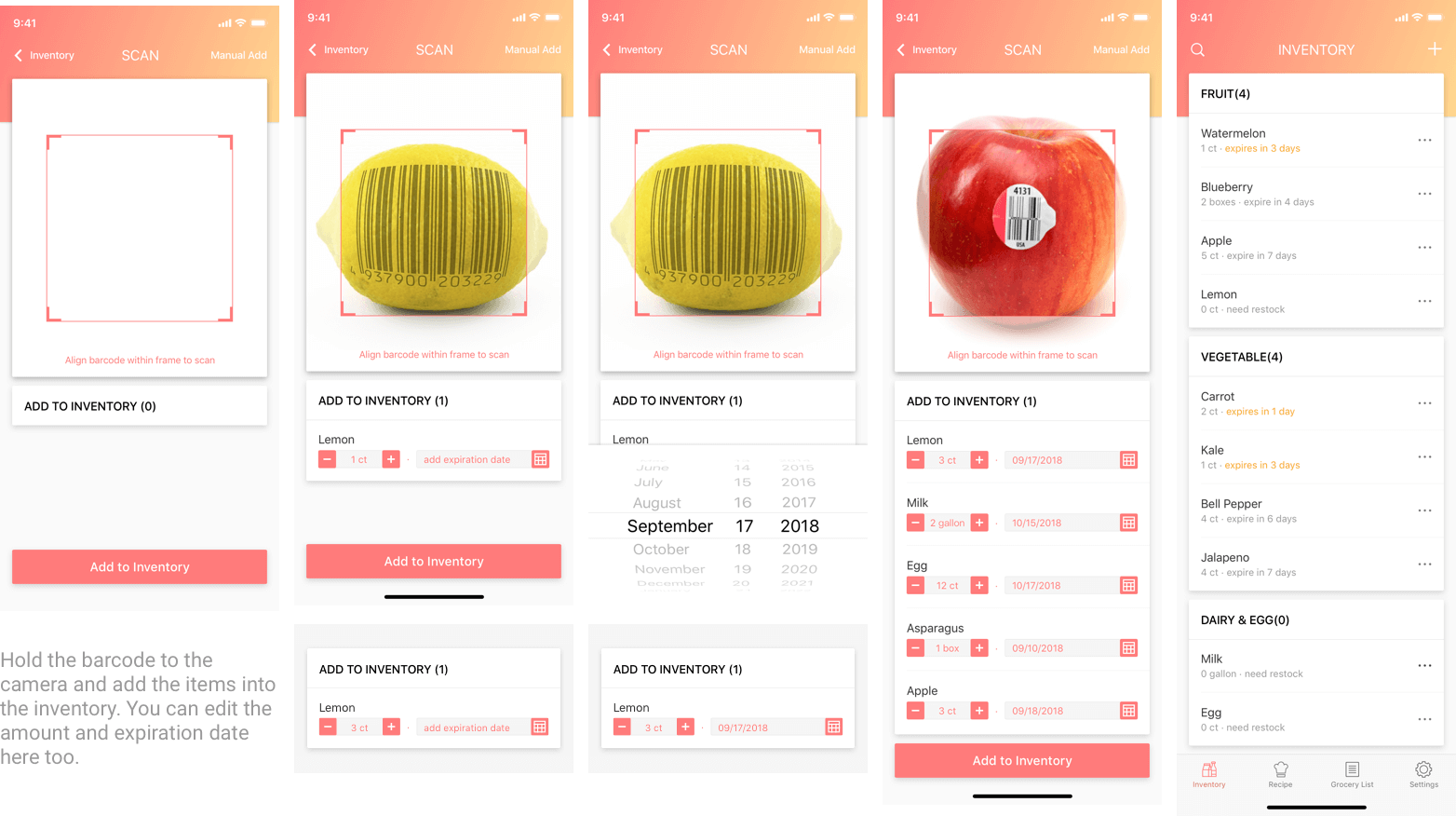
      This mobile application is an individual user interface design and prototyping exercise. The problem space being addressed here is to help households with multiple people to manage the food inventory collaboratively, seamlessly and easily. The app's features include collaborative grocery checklist, contextual grocery shopping reminder, food inventory management and recipe recommendation.

      INFO

      Category

        Individual UI Design&Prototyping Exercise

      Time & Duration

        Sep. 2018 / 2 Days


      Keywords

        UI Design, Mobile App, Prototyping

      Tools

        Paper and pen, Sketch, InVision

Persona

Target Audience + The Problem

Key Visual

Main Features + Color Scheme

User Flows

Key Interactions with the Features

      Manage Inventory

      Recipe

      Smart Notification & Shop Grocery Accordingly

      Add Inventory

Usability Test

User Testing with Interactive Mid-fidelity Prototype

      BRIEF

      This is a mobile application designed for users who live in a household with multiple people and share the food the inventory. People in the same household consume the food in the inventory together, and take turns to shop grocery. This app is to help the user better keep track of the food inventory. The purpose of this test is to acquire user feedback about 2 main user flows and other general features.

      Please follow the steps and talk-aloud while testing the prototype. The prototype is designed based on iPhone X and made with InVision.

      TASKS

      The participants were then provided with the prototype and the text-based instructions about the task. The flows with images were not provided as it would influence how they perceive the interface. The tasks include following user flows:

        1. Smart Notification & Shop Grocery Accordingly

        2. Add Inventory

        3. Manage Inventory

        4. Check Out Recipe

      PROTOTYPE

      https://invis.io/7QOLVP6G5VY

      Participant 1

      Part-time Student @ GT / Married and has 2 kids

      A perfect fit of the target audience of this application - there are currently 5 people in his household, and multiple people in the household take care of the grocery. Also, all of them share and consume the food. He is a working professional who is also a part-time master student at Tech, and his schedule is very tight too.

      Observation

      As we started the test and the notification showed up, it was natural for him to swipe to launch the app. It was very smooth while he was on the first task. While he was trying to tap into the ‘To Buy’ grocery list, he tapped the banner instead of the icon as he thought the entire element should be interactable instead of just the icon area. In the second task, he said that it will be great if the items are added while he was shopping grocery so that he wouldn't need to get into the app one more time after arriving home. The last two tasks were completed without any problem. The interactions seemed pretty smooth.

      Feedback

      As a firstly introduce the concept of the app, he immediately responded ‘ OK, you’ve sold me the idea!’ And he said the idea, in general, could be very useful considering the multi-people condition of his household.
      One concern is about the push notification at the beginning, as he personally does not like a lot of notifications showing up at a system level. He liked the idea of having a ticker on the homepage, and he suggested that the app should only push the notification when there’s something needs his Immediate attention.

      Participant 2

      PhD Student @ GT / Single / lives in a 1b1b

      Although he is not a perfect fit of the persona as he lives by himself, living a busy life as a PhD student, he sometimes forgets what he has bought, or forgets to go to the grocery, which makes him a potential user of the application.

      Observation

      As he was on the popup layer of managing inventory, he mentioned that the text on top explaining what the two columns were for should be more evident and visible. While he was on the Grocery List tab, he commented the ‘To Buy’ list should be on this level instead of a secondary page, and the history could be put at a secondary page because he’d be less likely to check them after he’s done with grocery shopping. He also mentioned that the app should provide a default name of grocery shopping record containing the purchaser’s name and the date so that people won’t need to edit them if they don’t want to. Per the task adding inventory, he commented that the app should provide a default expiration date for each item based on what it is. Editing the info for each can be very taxing. For managing the inventory, the ‘…’ dropdown didn’t make sense to him, and he thought the app should have a secondary page for reviewing each item’s details.

      Feedback

      He liked the idea in general, and he gave compliments about the visual design of the interface. He suggested replacing the list view of food inventory with photos to make the inventory list more intuitive.